Custom Coaster Design Ideas and Artwork Advice
Design ideas that read in a glance on a busy table, and artwork setup that gets your coasters printed without fuss.
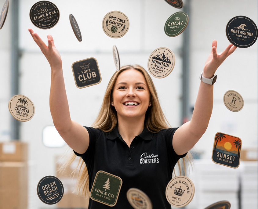
A good coaster design carries one clear message, a bold logo and text big enough to read at arm’s length in a dim bar. Crowding is the usual trap: too much information, with the text shrunk until nobody at the table can read it.
You have 95mm to work with on each side, so give each side one job. Put your brand on the front and use the back for a QR code, an upcoming event, a special or your contact details. High-contrast colours stay readable when the coaster gets wet, and lighter ink coverage lets the board keep soaking up condensation.
For inspiration, our gallery shows finished work we designed and printed, including round coasters for Remy’s in Paddington, Brisbane and square coasters with rounded corners for Budget Car Rental Central Queensland. When your own file is ready, the artwork guidelines cover setup, and you’ll normally have a proof to check within 1 to 2 hours.
If you have no artwork yet, your logo and a few notes on what the coaster needs to say are enough to start. Design is free for simple designs and for new customers.
Guides in this section
- Beer Coaster Design: The Do’s and Don’ts: The layout rules that keep a coaster readable in a glance, and the common mistakes that get it ignored.
- QR Code Beer Coasters: The Smartest Way for Venues to Promote Entertainment: Where a coaster QR code should point, from gig guides and trivia nights to menus, bookings and loyalty sign-ups.
- Artwork Guidelines: How to supply print-ready coaster artwork, covering bleed, CMYK colour, outlined text and image resolution.
- Coaster Gallery: Examples of finished coasters, round and square, to help you picture your own design before briefing us.
Common Questions
Use the back for one thing you want people to do. A QR code to your what’s on page, a happy hour, a loyalty sign-up, your Wi-Fi details or a social handle all work well. Keep your logo on the front so the brand is the first thing people see when the drink arrives at the table.
They print well, but heavy ink costs you absorbency. Large solid ink floods reduce how much condensation the board can soak up, so the coaster does its job less well. Clean logos, simple text and some bare board usually give the best result. If your brand relies on a dark background, talk to us before you finalise the file.
Yes, and short runs make it easy. Digital runs of 500 and 1,000 let you test a new design, print a seasonal one or give different venues their own version without ordering thousands of each. Some businesses put a unique QR code on each version so they can see which venue or promotion gets the most scans.
Ready to order?
When your design is ready, upload it through our artwork page and check the proof before a single coaster is printed.