Quick answer: Good beer coaster design keeps to one clear message, a bold logo and text big enough to read at arm’s length in a dim bar. Use strong colour contrast and put your call to action or QR code on the back. The most common mistake we see is cramming on too much information in text that’s too small.

Beer coasters are more than just a place to rest your drink. They’re compact, powerful marketing tools that sit directly in front of your audience for extended periods. Getting the design right can boost brand recognition, spark conversation, and even drive sales. Getting your beer coaster design wrong? Your coaster ends up ignored—or worse, in the bin. Here are the essential dos and don’ts of beer coaster design.
How Do You Design a Beer Coaster That Works?
-
Do Keep It Simple
A coaster is small. You don't have the luxury of space, so every element must earn its place. Stick to one clear message, a bold logo, and minimal text. Simplicity ensures your design is instantly readable, even in a dimly lit bar. -
Do Prioritise Your Brand
Your logo should be the hero. Use consistent brand colours, fonts, and imagery so the coaster is immediately recognisable. Think of it as a mini billboard—brand recall is the primary goal. -
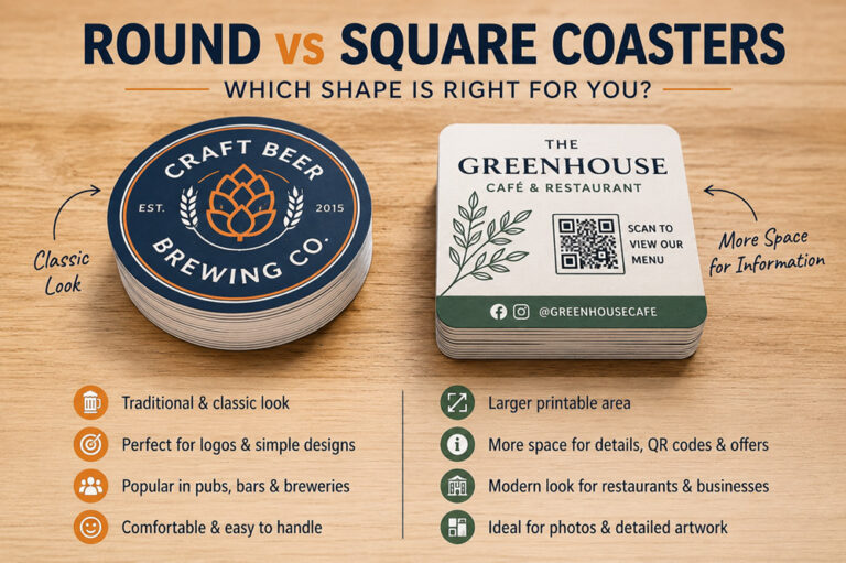
Do Consider the Shape
Round coasters are the standard, but square, hexagonal, or custom die-cut shapes can help you stand out on a crowded table. Just ensure the shape complements the design rather than complicating it. -
Do Use High-Contrast Colours
Bold colour contrast makes your design pop and improves legibility. A dark logo on a light background—or vice versa—ensures your message cuts through, even when the coaster is wet or stained. -
Do Think About Both Sides
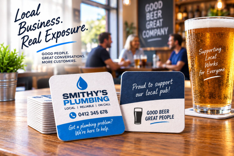
You have two surfaces to work with. Use the front for branding and the back for a call to action, QR code, social media handle, or a fun fact. Maximise the real estate. -
Do Account for Moisture
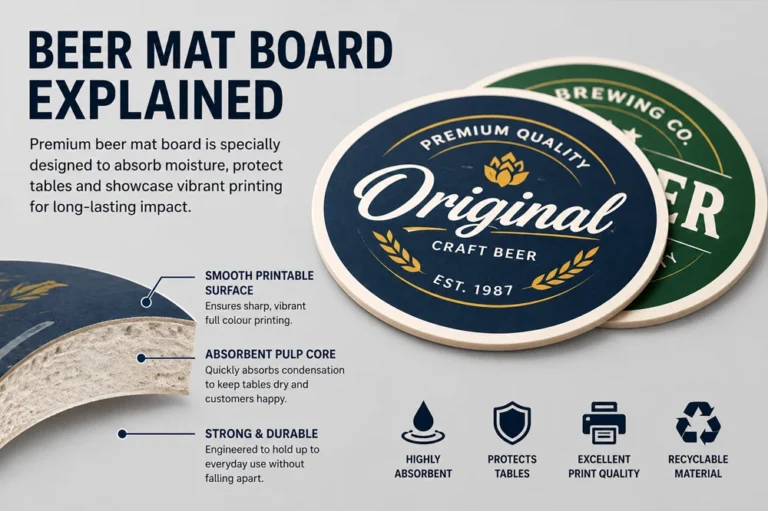
Beer coasters get wet. Choose materials and finishes that hold up against condensation. Make sure your design still looks good when damp—avoid fine details or ink choices that bleed easily.
What Should You Avoid on a Beer Coaster?
-
Don't Overcrowd the Design
Cramming too much text, multiple images, and several messages onto a small surface creates visual chaos. If people can't process your coaster in a glance, they won't bother trying. -
Don't Use Tiny Fonts
If your audience needs to squint, you've lost them. Keep text large enough to read comfortably at arm's length. As a rule, nothing should be smaller than 8pt—and bigger is almost always better. -
Don't Forget Your Audience
A craft brewery's coaster should look and feel different from a corporate drinks brand. Know your audience, their tastes, and the venues where the coasters will be placed. Design with them in mind. -
Don't Ignore Print Quality
A beautiful digital design can fall flat with poor printing. Work with a reputable printer, request samples, and choose quality cardboard or pulpboard stock that feels substantial in the hand. -
Don't Neglect the Call to Action
A coaster without a purpose beyond decoration is a missed opportunity. Whether it's "Scan here for 10% off," a website URL, or an Instagram handle, give people a reason to engage further. -
Don't Follow Trends Blindly
Trendy design elements can date quickly. Aim for a look that's fresh yet timeless. Your coasters may be in circulation for months, so avoid anything that will feel stale in a few weeks.
Final Thoughts
Great beer coaster design balances creativity with restraint. It respects the limited space, prioritises the brand, and always considers the end environment. Nail these dos and don’ts, and your coaster won’t just protect the table—it’ll work hard for your brand with every pint served.
What Do the Most Effective Beer Coaster Designs Have in Common?
The most effective beer coaster designs follow proven principles: keep the layout simple, focus on one clear message, use strong contrast for readability, and guide the eye with clean spacing and hierarchy. Avoid overcrowding the coaster with too much text or imagery—simple, bold designs are easier to read and far more memorable in busy pub and club environments. By using clear branding, a strong call-to-action, and uncluttered visuals, your beer coaster becomes a powerful marketing tool that captures attention, communicates quickly, and drives real engagement with your customers.
Ready to Order? Let’s Talk
Getting started is simple. Send us your artwork or get in touch with our team to discuss your requirements. We’ll review your design, advise on ink coverage and layout for the best result, and have your coasters on their way within 48 hours.
Give us a call today — we’re here to help you get the perfect coaster, exactly when you need it.
Frequently Asked Questions
We can, and for simple layouts or new customers it costs nothing. Complex graphics are $90 + GST. Send your logo, the message you want and any link for a QR code, and you’ll normally have a proof to look over within 1 to 2 hours, well before anything is printed.
You can, as long as it’s one strong image rather than a collage. Fine detail softens once the board is damp, so pick a photo with clear shapes and good contrast, and leave room for your logo. Large dark areas of solid ink also cut into how much condensation the board can soak up.
If you have somewhere useful to send people, yes. Link it to a page they actually want, such as your what’s on guide, weekly specials or table bookings, and print a short instruction beside it like ’Scan to book a table’. A QR code with no reason to scan is wasted space.
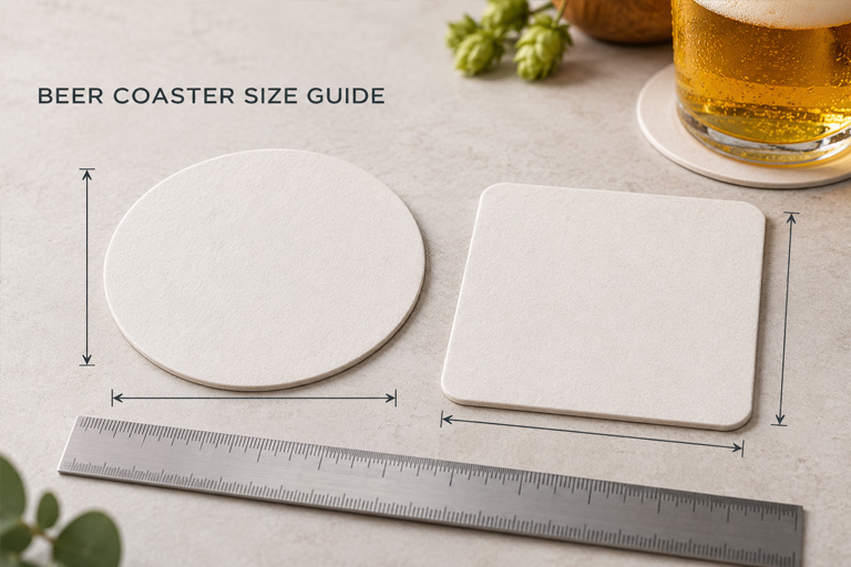
Round if the design is mostly a bold logo, square if it carries more. Round draws the eye to the centre, while square, with its rounded corners, gives a little more room for a QR code, offer or contact details. Either way you’re designing for 95 x 95mm, so keep text clear of the edges.
Use strong contrast, such as a dark logo on a light background, and skip fine detail that can blur once the board is damp. Keep the wording short and the type generous. If a line won’t read at arm’s length when the coaster is dry, it won’t read once it’s wet either.
Keep reading
- More Design and Artwork guides
- QR Code Beer Coasters: The Smartest Way for Venues to Promote Entertainment
- Coaster Size Guide: Dimensions, Shapes and Board Weights
- Beer Coaster Marketing Ideas: How to Promote Your Business with Creative Coasters
Before you sign off a layout, upload your coaster artwork and we’ll flag crowded text or small type while it’s still a proof.